Evaluation
My website is quite neat, it reflects on me and my work by showing that I don't like to over-complicate things, everything is easy to understand and to find but when I do feel passionate I like to write a lot and add lots of photos, because I am one of those people who can learn something by looking at a photo but can also get more information and detail by reading. I personally think life needs to be colourful, and by making my website colourful it can truly represent myself.
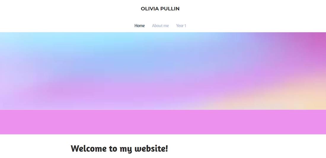
My website is bright and colourful, this represent who I am. I didn't want my website to be dark and bland, as there would then be no character to it, it would also not look appealing for people who just go onto my page. Having pastel colours (I think) is nice, as it's not an overload of colour but enough to grab someones attention, I think you could also close the colours as 'soft' rather than being 'harsh'. When researching the different websites, I liked the idea that Malika's website was colourful and that it grabbed my attention the first time I went on it but I do like the simplicity of Sean's page as it doesn't require much to get people interested and sometimes having photos (or cartoons) can get someone more interested.
|
|
I don't think Sean and mine website are similar, the only parts of really inspired on from his website is the use of having a white theme and having black text instead but other than that, my website is colourful and I don't use cartoons on my pages to make my page exciting but I did add photos to all of my units so you can understand by looking at the picture what the unit is and it's a photo that is related. The differences we have is I have written a long paragraph when talking about myself on the (About me) page but Sean prefers to keep his sentences short, which I can understand that it gets straight to the point but at the same time it doesn't give enough detail and I think that's the reason why he has a lot of places where people can contact him.

|
|
Malika's website is full of her own art-work and that's one of the reasons I loved it so much, it was personalised and told you a lot about her personality without using many words. I like the fact that the website is all about her art work and nothing more. The parts I have been inspired from is the colours, having more colour brings in more people, though our about me pages are very different, hers being short and simple, and mine going into a lot of detail, I felt I should share a lot about myself so people can either understand who the person is behind the website or could find out we have similar interest.
|

|
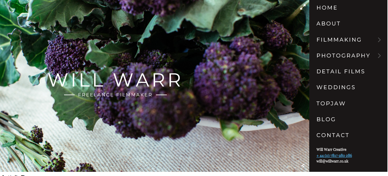
Will's home is quite simple but its tidy, that's what I wanted my website to look like. I think having a clear home page lets people know who you are.Will has an unusual photo as his home page which I think attracts people, maybe in the future I could do the same idea but I feel once I have found the perfect photo which represents me and my website but I think for now having the pastel coloured background fits.

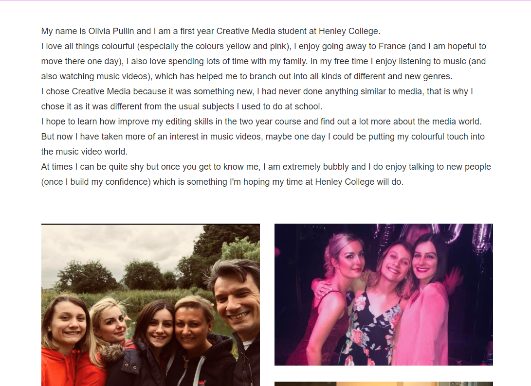
I think my portfolio says a lot about me, I wrote a long paragraph to sum up who I am, it lets the reader know more about the owner of the website. While seeing the other three websites who have a short description on who they're, I prefer reading a lot about someone to get an idea of this person I have never met and how much effort they put into their portfolio and website. I also added photos of my family and myself, so it's not all about work but can be about enjoying myself and showing others what I love, not only do I love doing Creative Media but I also really love my family.
